
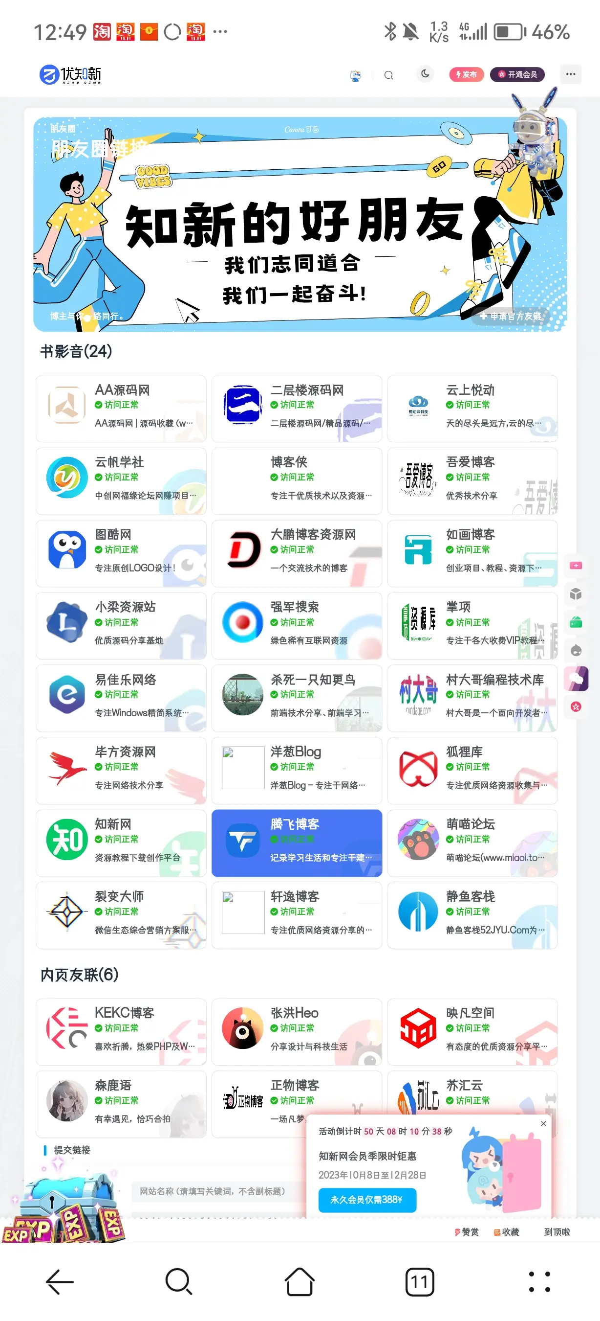
效果图
新建页面代码
<?php

/*

 *Template Name: 链接检测模版


 *网站:www.uzhix.com

 */

get_header();

// 网址访问判断

function httpcode($url){

        $ch = curl_init();

        $timeout = 5;

        curl_setopt($ch,CURLOPT_FOLLOWLOCATION,1);

        curl_setopt($ch,CURLOPT_RETURNTRANSFER,1);

        curl_setopt($ch, CURLOPT_HEADER, 1);

        curl_setopt ($ch, CURLOPT_CONNECTTIMEOUT, $timeout);

        curl_setopt($ch,CURLOPT_URL,$url);

        curl_exec($ch);

        return $httpcode = curl_getinfo($ch,CURLINFO_HTTP_CODE);

        curl_close($ch);

}

//链接访问状态判断函数

function link_status($link)

{

    //ini_set('max_execution_time',15);

    // $status=httpcode($link);
    $status=200;
    if($status == 200 )

        return '<p style="color: #1bbb1b;"><i class="fa fa-check-circle" aria-hidden="true"></i> 访问正常</p>';

    else

        return '<p style="color: #CCA700"><i class="fa fa-exclamation-circle" aria-hidden="true"></i>  无法访问</p>';

}


//列出指定链接
 $count_type =0;
function the_link_items($id = null)

{

    $bookmarks = get_bookmarks('orderby=date&category=' . $id);

    $output = '';

    if (!empty($bookmarks)) {
        global $count_type;
        $output .= '<ul class="link-items fontSmooth">';
        $count_type=count($bookmarks);
        foreach ($bookmarks as $bookmark) {

            if (empty($bookmark->link_description)) {

                $bookmark->link_description = __('This guy is so lazy ╮(╯▽╰)╭', 'sakurairo');

            }


            if (empty($bookmark->link_image)) {

                $bookmark->link_image = 'https://view.moezx.cc/images/2017/12/30/Transparent_Akkarin.th.jpg';

            }

            $output .= '<li class="link-item"><a class="link-item-inner effect-apollo" href="' . $bookmark->link_url . '" title="' . $bookmark->link_description . '" target="_blank" rel="friend"><img src="' . $bookmark->link_image . '" src="/load/inload.svg"><span class="sitename">' . $bookmark->link_name . '</span><span>' . link_status($bookmark->link_url). '</span><div class="linkdes">' . $bookmark->link_description . '</div><div class="flink-item-bg"><img style="width: 100%;height: 100%;" src="' . $bookmark->link_image . '" src="/load/inload.svg"></div>  </a></li>';

        }

        $output .= '</ul>';

    }

    return $output;

}


//列出所有链接

function link_items()

{

    $linkcats = get_terms('link_category');
    if (!empty($linkcats)) {
         global $count_type,$linkcat;
         $result='';
        foreach ($linkcats as $linkcat) {
            $html=the_link_items($linkcat->term_id);
            $result .= '<h3 class="link-title"><span class="link-fix">' . $linkcat->name .'('.$count_type.')'. '</span></h3>';

            if ($linkcat->description) {

                $result .= '<div class="link-description">' . $linkcat->description . '</div>';

            }


            $result .= $html;

        }

    } else {
        $result = the_link_items();

    }
    $post_id='';
    $submit_args = array(
                        'title'    => get_post_meta($post_id, 'page_links_submit_title', true),
                        'subtitle' => get_post_meta($post_id, 'page_links_submit_subtitle', true),
                        'dec'      => get_post_meta($post_id, 'page_links_submit_dec', true),
                    );

    return $result .'<div class="box-body notop" id="申请友链"><div class="title-theme">提交链接</div></div>' . zib_submit_links_card($submit_args);

}


?>

    <?php while(have_posts()) : the_post(); ?>

    <?php if( !get_post_thumbnail_id(get_the_ID())) { ?>
  <main class="container">
    <div class="content-wrap">
        <div class="content-layout">
    <div class="zib-widget">
        <span class="linkss-title" style="display: none;"><?php the_title();?></span>
       <div class="page-top-card" style="background-image: url(https://www.kvmao.com/resources/tvlogo/517c7c5d4790-scaled.jpg);"><div class="content-item-tips"><?php the_title();?></div><span class="content-item-title"><?php the_title();?>链接</span><div class="content-bottom"><div class="tips">博主与你一路同行。</div><a class="banner-button" href="#申请友链" data-pjax-state="anchor"><i class="fa fa-plus"></i><span>申请友链</span></a></div></div>
    <?php } ?>

        <article <?php post_class("post-item"); ?>>

            <?php the_content(); ?>

            <div class="links">

                <?php echo link_items();//列出所有友情链接,若列出分组id为49的则改为the_link_items('49') ?>

            </div>

        </article>

        <?php comments_template('/template/comments.php', true); ?>
      </div>
      </div>
      </div>
      </main>
    <?php endwhile; ?>
<?php

get_footer();
CSS样式代码
/*朋友圈*/
.al_year{margin-left:-55px}

.cat-des p {
    display: inline-block;
    padding-left: 10px
}

h1 {
    clear: both
}

h1.cat-title {
    display: inline-block;
    font-size: 25px;
    font-weight: 400;
    padding-right: 15px;
    border-right: 1px dashed #ddd;
    color: #0084FE
}


header.page-header {
    position: relative;
    text-align: center;
    margin-bottom: 50px;
    color: #9C9C9C
}

.links {
    margin-bottom: 80px
}
.links ul {
    margin: 0;
    list-style: none;
    padding: 0;
    width: 100%;
    display: inline-block
}

.links ul li {
    height: 110px;
    width: 32%;
    float: left;
    border: 1px solid #ddd;
    padding: 10px 15px;
    margin: 4px 4px;
    position: relative;
    overflow: hidden;
    -webkit-transition: all .3s;
    transition: all .3s;
    border-radius: 10px
}


.links ul li img {
    float: left;
    /*box-shadow: inset 0 0 10px #0084FE;*/
    padding: 5px;
    opacity: 1;
    transform: rotate(0);
    -webkit-transform: rotate(0);
    -moz-transform: rotate(0);
    -o-transform: rotate(0);
    -ms-transform: rotate(0);
    transition: all ease 1s;
    -webkit-transition: all ease 1s;
    -moz-transition: all ease 1s;
    -o-transition: all ease 1s;
    margin-top: 3px;
    width: 70px;
    height: 70px;
    padding: 1px;
    border-radius: 100%
}


.links ul li:hover img {
    /*transform: rotate(360deg);*/

    /*-webkit-transform: rotate(360deg);*/

    /*-moz-transform: rotate(360deg);*/

    /*-o-transform: rotate(360deg);*/

    /*-ms-transform: rotate(360deg)*/
}


span.sitename {
    font-size: 20px;
    /*margin-top: 85px;*/
    margin-left: 8px;
    /*color: #000;*/

    /*padding-bottom: 10px;*/
    padding-left: 10px;
    display: block;
    -webkit-transition: all .3s;
    transition: all .3s;
    overflow: hidden;
    text-overflow: ellipsis;
    -o-text-overflow: ellipsis;
    white-space: nowrap
}

 .links span i
 {
    padding-left: 10px;
 }


.linkdes {
    padding-left: 10px;
    /*color: #000;*/
    font-size: 14px;
    /*padding: 4px 0;*/
    margin-left: 8px;
    /*border-top: 1px dotted #0084FE;*/
    text-overflow: ellipsis;
    overflow: hidden;
    white-space: nowrap;
    line-height: 20px;
    -webkit-transition: all .5s;
    transition: all .5s
}

 @media screen and (max-width: 768px){
.links ul li {
    width: 100%;
}
}

.link-title {
    font-weight: 400;
    color: #1f2d3d;
    padding-left: 10px;
    border-left: none;
    margin: 20px 0 20px
}

 .link-description{
     margin-bottom: 1rem;
    line-height: 1;
    margin-left: 10px;
 }

.link-title span.link-fix {

    /*padding-left: 10px;*/

    /*border-left: 3px solid #0084FE;*/

}

 .page-top-card {
    background-size: cover;
    background-position: center;
    height: 35rem;
    padding: 10px 2.7rem;
    border-radius: 20px;
    color: #fff;
    position: relative;
}

span.content-item-title {
    font-size: 2.3em;
    font-weight: 700;
}
.content-bottom {
    display: flex;
    justify-content: space-between;
    align-items: center;
    position: absolute;
    width: calc(100% - 5.4rem);
    bottom: 1rem;
}
a.banner-button {
    cursor: pointer;
    color: #fff!important;
    backdrop-filter: saturate(180%) blur(20px);
    background: rgb(120 120 120 / 30%);
    padding: 5px 15px;
    border-radius: 100px;
    text-decoration: none!important;
}
a.banner-button i {
    margin-right: 5px;
}

.links ul li:before {
    content: "";
    background-color: #0084FE;
    -webkit-transform: skew(45deg, 0);
    transform: skew(45deg, 0);
    width: 0;
    height: 100%;
    position: absolute;
    top: 0;
    left: -60px;
    z-index: -1;
    -webkit-transition: all .5s;
    transition: all .5s
}


.links ul li:hover {
    color: #fff !important;
    /*border: 1px solid #0084FE*/
    background: #4976f5;
    border-color: #4976f5;
}

.links a:focus,.links a:hover {
    color: #fff !important;
    outline: 0;
    text-decoration: none;
}

.links ul li:hover:before {
    width: 180%
}


.links ul li:hover .linkdes {
    /*border-top: 1px dashed #fff*/
}

.links .flink-item-bg {
    position: absolute;
    bottom: 0;
    right: 0;
    transform: translate(35%,35%);
    transition: .5s;
    width: 120px;
    height: 120px;
    opacity: .2;
    border-radius: 9999px;
    overflow: hidden;

}


span.linkss-title {
    font-size: 25px;
    text-align: center;
    display: block;
    margin: 50px 0 30px;
    letter-spacing: 5px
}


.mashiro-tips {
    opacity: 0;
    width: 250px;
    height: auto;
    min-height: 70px;
    margin: -20px 20px;
    padding: 5px 10px;
    border-radius: 12px;
    box-sizing: border-box;
    box-shadow: 0 0 2px 0 rgba(0, 0, 0, .12), 0 2px 2px 0 rgba(0, 0, 0, .24);
    transition: box-shadow .2s ease;
    background: #fff;
    color: #212121;
    font-size: 12px;
    text-overflow: ellipsis;
    overflow: hidden;
    position: absolute;
    animation-delay: 5s;
    animation-duration: 50s;
    animation-iteration-count: infinite;
    animation-name: shake;
    animation-timing-function: ease-in-out
}


@keyframes shake {

    2% {

        transform: translate(.5px, -1.5px) rotate(-.5deg)

    }

    4% {

        transform: translate(.5px, 1.5px) rotate(1.5deg)

    }

    6% {

        transform: translate(1.5px, 1.5px) rotate(1.5deg)

    }

    8% {

        transform: translate(2.5px, 1.5px) rotate(.5deg)

    }

    10% {

        transform: translate(.5px, 2.5px) rotate(.5deg)

    }

    12% {

        transform: translate(1.5px, 1.5px) rotate(.5deg)

    }

    14% {

        transform: translate(.5px, .5px) rotate(.5deg)

    }

    16% {

        transform: translate(-1.5px, -.5px) rotate(1.5deg)

    }

    18% {

        transform: translate(.5px, .5px) rotate(1.5deg)

    }

    20% {

        transform: translate(2.5px, 2.5px) rotate(1.5deg)

    }

    22% {

        transform: translate(.5px, -1.5px) rotate(1.5deg)

    }

    24% {

        transform: translate(-1.5px, 1.5px) rotate(-.5deg)

    }

    26% {

        transform: translate(1.5px, .5px) rotate(1.5deg)

    }

    28% {

        transform: translate(-.5px, -.5px) rotate(-.5deg)

    }

    30% {

        transform: translate(1.5px, -.5px) rotate(-.5deg)

    }

    32% {

        transform: translate(2.5px, -1.5px) rotate(1.5deg)

    }

    34% {

        transform: translate(2.5px, 2.5px) rotate(-.5deg)

    }

    36% {

        transform: translate(.5px, -1.5px) rotate(.5deg)

    }

    38% {

        transform: translate(2.5px, -.5px) rotate(-.5deg)

    }

    40% {

        transform: translate(-.5px, 2.5px) rotate(.5deg)

    }

    42% {

        transform: translate(-1.5px, 2.5px) rotate(.5deg)

    }

    44% {

        transform: translate(-1.5px, 1.5px) rotate(.5deg)

    }

    46% {

        transform: translate(1.5px, -.5px) rotate(-.5deg)

    }

    48% {

        transform: translate(2.5px, -.5px) rotate(.5deg)

    }

    50% {

        transform: translate(-1.5px, 1.5px) rotate(.5deg)

    }

    52% {

        transform: translate(-.5px, 1.5px) rotate(.5deg)

    }

    54% {

        transform: translate(-1.5px, 1.5px) rotate(.5deg)

    }

    56% {

        transform: translate(.5px, 2.5px) rotate(1.5deg)

    }

    58% {

        transform: translate(2.5px, 2.5px) rotate(.5deg)

    }

    60% {

        transform: translate(2.5px, -1.5px) rotate(1.5deg)

    }

    62% {

        transform: translate(-1.5px, .5px) rotate(1.5deg)

    }

    64% {

        transform: translate(-1.5px, 1.5px) rotate(1.5deg)

    }

    66% {

        transform: translate(.5px, 2.5px) rotate(1.5deg)

    }

    68% {

        transform: translate(2.5px, -1.5px) rotate(1.5deg)

    }

    70% {

        transform: translate(2.5px, 2.5px) rotate(.5deg)

    }

    72% {

        transform: translate(-.5px, -1.5px) rotate(1.5deg)

    }

    74% {

        transform: translate(-1.5px, 2.5px) rotate(1.5deg)

    }

    76% {

        transform: translate(-1.5px, 2.5px) rotate(1.5deg)

    }

    78% {

        transform: translate(-1.5px, 2.5px) rotate(.5deg)

    }

    80% {

        transform: translate(-1.5px, .5px) rotate(-.5deg)

    }

    82% {

        transform: translate(-1.5px, .5px) rotate(-.5deg)

    }

    84% {

        transform: translate(-.5px, .5px) rotate(1.5deg)

    }

    86% {

        transform: translate(2.5px, 1.5px) rotate(.5deg)

    }

    88% {

        transform: translate(-1.5px, .5px) rotate(1.5deg)

    }

    90% {

        transform: translate(-1.5px, -.5px) rotate(-.5deg)

    }

    92% {

        transform: translate(-1.5px, -1.5px) rotate(1.5deg)

    }

    94% {

        transform: translate(.5px, .5px) rotate(-.5deg)

    }

    96% {

        transform: translate(2.5px, -.5px) rotate(-.5deg)

    }

    98% {

        transform: translate(-1.5px, -1.5px) rotate(-.5deg)

    }

    0%,

    100% {

        transform: translate(0, 0) rotate(0)

    }

}


@-webkit-keyframes glitch-loop-1 {

    0% {

        clip: rect(36px, 9999px, 9px, 0)

    }

    25% {

        clip: rect(25px, 9999px, 99px, 0)

    }

    50% {

        clip: rect(50px, 9999px, 102px, 0)

    }

    75% {

        clip: rect(30px, 9999px, 92px, 0)

    }

    100% {

        clip: rect(91px, 9999px, 98px, 0)

    }

}


@keyframes glitch-loop-1 {

    0% {

        clip: rect(36px, 9999px, 9px, 0)

    }

    25% {

        clip: rect(25px, 9999px, 99px, 0)

    }

    50% {

        clip: rect(50px, 9999px, 102px, 0)

    }

    75% {

        clip: rect(30px, 9999px, 92px, 0)

    }

    100% {

        clip: rect(91px, 9999px, 98px, 0)

    }

}


@-webkit-keyframes glitch-loop-2 {

    0% {

        top: -1px;

        left: 1px;

        clip: rect(65px, 9999px, 119px, 0)

    }

    25% {

        top: -6px;

        left: 4px;

        clip: rect(79px, 9999px, 19px, 0)

    }

    50% {

        top: -3px;

        left: 2px;

        clip: rect(68px, 9999px, 11px, 0)

    }

    75% {

        top: 0;

        left: -4px;

        clip: rect(95px, 9999px, 53px, 0)

    }

    100% {

        top: -1px;

        left: -1px;

        clip: rect(31px, 9999px, 149px, 0)

    }

}


@keyframes glitch-loop-2 {

    0% {

        top: -1px;

        left: 1px;

        clip: rect(65px, 9999px, 119px, 0)

    }

    25% {

        top: -6px;

        left: 4px;

        clip: rect(79px, 9999px, 19px, 0)

    }

    50% {

        top: -3px;

        left: 2px;

        clip: rect(68px, 9999px, 11px, 0)

    }

    75% {

        top: 0;

        left: -4px;

        clip: rect(95px, 9999px, 53px, 0)

    }

    100% {

        top: -1px;

        left: -1px;

        clip: rect(31px, 9999px, 149px, 0)

    }

}


.art .art-content #archives a:before,

.art .art-content .al_mon_list li:before {

    content: none

}


#archives ul {
    list-style: none;
    margin-bottom: 0;
    left: -45px
}


#archives li {
    list-style: none
}


#archives li>ul,li>ol {
    margin-left: -2.7em
}


#archives h3 {
    margin-top: 0;
    margin-bottom: 0
}


.art-content #archives .al_mon_list {
    position: relative;
    padding: 10px 0;
    display: inline-block;
    vertical-align: middle
}


.art .art-content #archives a {
    color: #000
}


.art .art-content #archives a:hover {
    color: #0084FE

}


.art .art-content #archives .al_year {
    padding-left: 100px

}


.art .art-content .al_mon_list .al_post_list>li,
.art-content #archives .al_mon_list .al_mon {
    position: relative;
    color: #0084FE;
}


.art-content #archives .al_mon_list .al_mon,
.art-content #archives .al_mon_list span {
    padding: 0;
    border-radius: 0;
    margin: 0;
    color: #0084FE;
    background: 0 0;
    font-weight: 400
}


.art .art-content #archives a {
    font-weight: 400
}


.art .art-content .al_mon_list {
    width: 100%
}


.art .art-content .al_mon_list .al_post_list>li:before {
    position: absolute;
    left: 116px;
    background: #fff;
    height: 12px;
    width: 12px;
    border-radius: 6px;
    top: 6px;
    content: ""
}


.art .art-content .al_mon_list .al_post_list>li:after {
    position: absolute;
    left: 118px;
    background: #0084FE;
    height: 8px;
    width: 8px;
    border-radius: 6px;
    top: 8px;
    content: ""
}


.art-content #archives .al_mon_list .al_mon:before {
    position: absolute;
    left: 113px;
    background: #fff;
    height: 18px;
    width: 18px;
    border-radius: 9px;
    top: 3px;
    content: ""

}
.art-content #archives .al_mon_list .al_mon:after {
    position: absolute;
    left: 116px;
    background: #0084FE;
    height: 12px;
   width: 12px;
    border-radius: 6px;
    top: 6px;
    content: ""
}

.art .art-content .al_mon_list .al_post_list>li {
    padding-left: 140px
}

.art-content #archives .al_mon,
.art-content #archives .al_mon_list .al_post_list {
    display: block
}

.art-content #archives .al_mon_list:before {
    max-height: 100%;
    height: 100%;
    width: 4px;
    background: #0084FE;
    position: absolute;
    left: 120px;
    content: "";
    top: 0

}


.art .art-content .al_mon_list .al_post_list>li:before,
.art-content #archives .al_mon_list .al_mon:before {
    -webkit-box-shadow: 1px 1px 1px #bbb;
    box-shadow: 1px 1px 1px #bbb
}


.art .art-content .al_mon_list .al_post_list>li:after,

.art-content #archives .al_mon_list .al_mon:after {
    background: #0084FE
}

 .art-content #archives{margin-left:16%}

 #al_expand_collapse{margin-right:30%}

 #page .type-page {margin:0 18%}
已上传文件,但仅做内部保留。
© 版权声明
文章版权归作者所有,未经允许请勿转载。
THE END


- 最新
- 最热
只看作者